Introduction to Price Charts

graphical representations of the historical price

Nitin Ppre-open market, nitin patil

Introduction to Price Charts

Price charts are graphical representations of the historical price movements of financial assets over specific time periods. They are essential tools for traders, analysts, and investors to visualize and analyze market data, make informed decisions, and identify patterns, trends, and potential trading opportunities. Price charts provide valuable insights into the behavior of market participants and the supply and demand dynamics of a particular asset.

Key components of a price chart include:

  1. Price Axis: The vertical axis on the chart represents the price levels of the asset being analyzed. The price range covered by the axis depends on the selected time frame.

  2. Time Axis: The horizontal axis displays the time periods under consideration, such as minutes, hours, days, weeks, or months. Each time interval corresponds to a specific bar or candle on the chart.

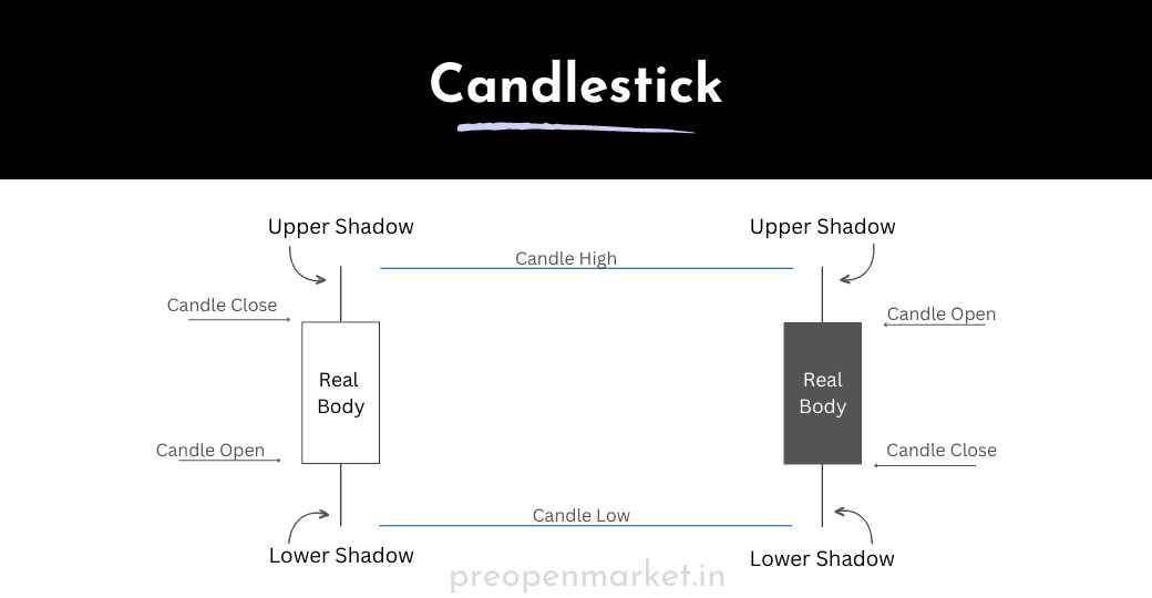
  3. Candlesticks or Bars: Each period on the chart is represented by a candlestick or a bar. These visual elements show the open, high, low, and close prices of the asset within that period.

  4. Open Price: The opening price of the asset during the chosen time interval is represented by the starting point of the candlestick or bar.

  5. High Price: The highest price reached during the time interval is shown as the upper point of the vertical line (wick or shadow) on the candlestick or bar.

  6. Low Price: The lowest price reached during the time interval is indicated by the lower point of the vertical line (wick or shadow) on the candlestick or bar.

  7. Close Price: The closing price of the asset at the end of the time interval is represented by the ending point of the candlestick or bar.

candlestick

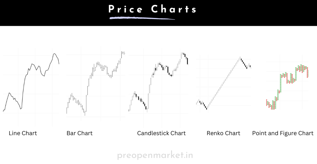
Price charts come in various formats, with the most common types being:

  • Line Chart: Connects the closing prices of an asset over time with a continuous line. It provides a simplified view of price trends.

  • Bar Chart: Uses vertical bars to show the range between the high and low prices for each period. The opening and closing prices are indicated by horizontal lines on the bar.

  • Candlestick Chart: Similar to a bar chart but visually more comprehensive. Each candlestick includes the same information as a bar (open, high, low, close) but is also color-coded to indicate whether the price rose (bullish) or fell (bearish).

  • Renko Chart: Represents price movements in bricks of a predetermined size, ignoring time. New bricks form only when the price moves beyond a specified threshold.

  • Point and Figure Chart: Focuses solely on price movements and ignores time. It uses Xs and Os to represent bullish and bearish price movements, respectively.

price charts

Price charts serve as a foundation for technical analysis, allowing traders to apply various tools and techniques to identify patterns, trends, support and resistance levels, and potential entry and exit points for trading decisions. By studying price charts, market participants can better understand the market's behavior and make informed judgments about future price movements.

Price charts can be used to identify support and resistance levels, trend lines, and patterns. They can also be used to calculate technical indicators, such as moving averages and relative strength index (RSI).

To use price charts effectively, it is important to understand the different types of charts and how to interpret them. It is also important to practice using price charts on a demo account before trading with real money.

Here are some additional tips for using price charts:

  • Use multiple time frames: It is best to use multiple time frames to get a better understanding of the market trend. For example, you could use a daily chart to identify the overall trend, and then use a 4-hour chart to identify potential trading opportunities.
  • Use technical indicators: Technical indicators can help you to confirm price action signals and to identify potential trading opportunities. However, it is important to remember that technical indicators are lagging indicators, which means that they can only tell you what has happened in the past, not what will happen in the future.
  • Use a stop loss: Always use a stop loss to limit your losses in case the trade goes against you.
  • Be patient: Don't enter a trade just because a price action signal is triggered. Wait for a good opportunity to enter a trade.
  • Practice on a demo account: Before you start trading with real money, it is important to practice using price charts on a demo account. This will allow you to learn how to use the price action techniques and to develop your trading skills.

FAQ on 'Introduction to Price Charts'

know the answers to most commonly asked questions

Nitin P

What is the purpose of using price charts in trading and analysis?

Price charts provide a visual representation of historical price movements, helping traders and analysts identify patterns, trends, support and resistance levels, and potential trading opportunities.

How do I choose the right time frame for my price chart?

The time frame depends on your trading style and objectives. Shorter time frames (e.g., minutes or hours) are suitable for day trading, while longer time frames (e.g., daily or weekly) are better for swing trading or long-term analysis.

What do the different components of a candlestick or bar represent?

A candlestick or bar represents the open, high, low, and close prices of an asset during a specific time interval. The body of the candle/bar represents the range between the open and close prices, while the wicks (shadows) show the high and low prices.

How do I interpret bullish and bearish candlesticks on a candlestick chart?

 A bullish (green or white) candlestick indicates that the closing price is higher than the opening price. A bearish (red or black) candlestick indicates that the closing price is lower than the opening price.

What is the significance of support and resistance levels on a price chart?

Support levels are where prices historically struggle to fall below, while resistance levels are where prices have difficulty rising above. These levels can indicate potential turning points in the market.

Can I use multiple types of price charts simultaneously for analysis?

Yes, you can use multiple types of charts to gain different perspectives on price movements. Combining candlestick, bar, and line charts can provide a comprehensive view of the market.

What are some common chart patterns to watch for on price charts?

Common chart patterns include head and shoulders, double tops and bottoms, triangles, flags, and pennants. These patterns offer insights into potential trend reversals or continuations.

How do I identify trends on a price chart?

An uptrend is characterized by higher highs and higher lows, while a downtrend has lower highs and lower lows. Sideways trends (consolidation) have relatively flat price movements.

Do price charts include fundamental information about an asset?

No, price charts focus primarily on historical price movements and do not incorporate fundamental data such as earnings, news, or economic indicators.

How do I use price charts in conjunction with other analysis tools?

 You can combine price charts with technical indicators (e.g., moving averages, RSI, MACD) and fundamental analysis to make more informed trading decisions. Using multiple tools can provide a well-rounded view of the market.

Remember that price charts are a foundational tool in trading, but they should be used in conjunction with other forms of analysis and risk management techniques. Continuously practicing and refining your chart analysis skills can improve your ability to interpret and utilize price charts effectively.

What are the risks of using price charts?

There are a few risks associated with using price charts, including:

  • Market volatility: The market can be volatile, and even the best price action traders will experience losses.
  • Overtrading: It is easy to overtrade when using price charts. It is important to be patient and to only enter trades when there is a clear signal.
  • Confirmation bias: It is easy to fall victim to confirmation bias when using price charts. It is important to be objective and to consider all the evidence before making a trading decision.

How can I reduce the risks of using price charts?

There are a few things you can do to reduce the risks of using price charts, including:

  • Use multiple time frames: It is best to use multiple time frames to get a better understanding of the market trend. For example, you could use a daily chart to identify the overall trend, and then use a 4-hour chart to identify potential trading opportunities.
  • Use technical indicators: Technical indicators can help you to confirm price action signals and to identify potential trading opportunities. However, it is important to remember that technical indicators are lagging indicators, which means that they can only tell you what has happened in the past, not what will happen in the future.
  • Use a stop loss: Always use a stop loss to limit your losses in case the trade goes against you.
  • Be patient: Don't enter a trade just because a price action signal is triggered. Wait for a good opportunity to enter a trade.
  • Practice on a demo account: Before you start trading with real money, it is important to practice using price charts on a demo account. This will allow you to learn how to use the price action techniques and to develop your trading skills.